
WELCOME
Welcome visitors to your site with a short, engaging introduction. Double click to edit and add your own text.
DAYSTREAM
user interface redesign project
OVERVIEW
Daystream is a redesigned version of Soundcloud, a music streaming app. Unlike other streaming apps, SoundCloud allows all users to upload music to the platform and enable users to comment, like, and share songs, making the app operate as a social media site rather than a streaming service.
Through a process of heuristic evaluation, user research, and app flow analysis, a prototype of a new with a consistent and aesthetic layout with interactive components was built.
ROLE
UI UX Designer
User Research, Interaction, Visual design, Prototyping
& Testing
Figma, Adobe After Effects, Photoshop, Procreate
March 2022 - June 2022
The Original App: SoundCloud
APP FLOW

DESCRIPTION
Soundcloud is a free mobile app that provides an online audio streaming and distribution platform. The app offers free and paid subscriptions that allow users to stream, promote, and share music and podcasts. Features that enable users to comment, like, and share songs also allows the platform to operate as a social media site rather than a streaming service, making it different from other music apps. While the song is playing, a unique feature of popping-up comments on the song also appear on the screen, making the app more interactive for users.
TASK FLOW
1. Go to stream tab from home page
2. Scroll through tracks/albums/playlists from following
3. Select a single track/album/playlist
4. Tap on the ongoing song to like, comment, share, repost on feed, or create a playlist
5. Tap anywhere on the screen to pause and swipe to change songs
UNDERSTANDING THE PROBLEM
USER PROFILE
Kaitlyn is a sophomore in college majoring in Music Industry. Listening to music is part of her everyday routine. She listens to music through her headphones while commuting to school, working out at the gym, studying, and relaxing at home. Kaitlyn loves attending concerts and sharing new and upcoming music with her friends through her own playlists.

NEEDS
-
Create and share playlists easily
-
Easy browse function for new music
-
Provide other essential features of streaming music
PAIN POINTS
-
Repetitions of tracks on streaming feed
-
Complicated process of creating and adding songs to playlist
-
Touchability of play controls is too sensitive
BRANDING RESEARCH

NAME
The name "Daystream" is chosen as I want this app to be user-friendly and aesthetic to the point that users can stream them all day all night
LOGO
The name "Daystream" is chosen as I want this app to be user-friendly and aesthetic to the point that users can stream them all day all night
COLOR PALETTE
Blue and purple are soothing colors and their combination creates a calming and visually appealing for the music streaming app.
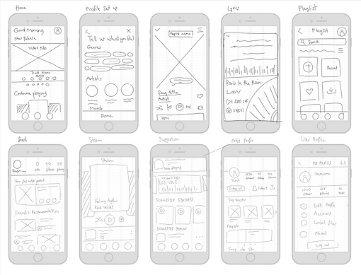
WIFEFRAME SKETCHES
I brainstormed and made three different versions of wireframes for the screens I'm designing based on the user persona's needs and pain points. I focus on the diversity of different elements that appear on the screen and minimize the number of categories that pop up on a single screen. I then took feedback from my peers and picked different screens from each version to build a solid low-fidelity screens for the app.


LOW-FIDELITY SCREENS + WIREFLOW

I reduced and refined the wireframe sketches into low-fidelity screens that provide possible solutions for the needs and pain points:
-
Eliminate unnecessary information (repeated charts, irrelevant suggestions, etc) to reduce content density on one screen
-
Reducing the number of steps to minimize time to completion
-
Establishing a clearer visual form hierarchy by grouping related fields
-
Create an appealing layout with well-organized components
HIGH FIDELITY SCREENS + ANIMATED PROTOTYPE
I created the high-fidelity screens using Figma combined with illustrations/images made in Photoshop then imported them into Adobe After Effects to demonstrate the user flow throughout different screens.
Since not all components are imported exactly the same in Figma, I modified some details in Adobe After Effects. Many animations are applied to create unique interaction for users using this app.


CHANGES KEY TAKEAWAYS
-
Content distribution: no repetition in the organization and each category is classified differently (5 tabs to 3 tabs).
-
Home page: each section is arranged in different ways
-
Stream page: the new feed is categorized into two different groups, the users' friends and artists. The search bar is also added to this page instead of a separate tab.
-
View Track: The play button is added to prevent touch sensitivity, the track image is scaled down, and other functions including loop, shuffle, and lyrics are added.
-
-
Letting go of the designs: the original design might be modified a lot throughout the design process, and it is essential to letting go of some design elements as more issues can be found during this process. Many elements can be changed, then changed again, or even deleted and I need to be ready to remove or add back any components in my design
-
Put more focus on interaction: it is very important to pay attention to every interaction and create new ones, especially microinteractions. They provide better connectivity between users and interfaces: show immediate feedback upon actions, guide users along with their online experience, save time and keep users informed on what’s happening.
-
Place users in control of the interface: always think from the perspective of the user to fully comprehend their experience and make sure that users know what they are doing in each step
.png)

