
WELCOME
Welcome visitors to your site with a short, engaging introduction. Double click to edit and add your own text.
USTHEBASIC
user interface redesign project

OVERVIEW
Usthebasic is an e-commerce website for woman’s clothing. The original website lacks visual appeal and readability, and has unorganized navigation and interaction, making it complicated for users to shop online.
Through a process of heuristic evaluation, user research, and usability testing, a responsive prototype of this website with a consistent and aesthetic layout with interactive components was built.
ROLE
UI UX Designer
User Research, Card Sorting, Interaction, Visual design, Prototyping & Testing
Figma, Photoshop
Sept 2021 - March 2022
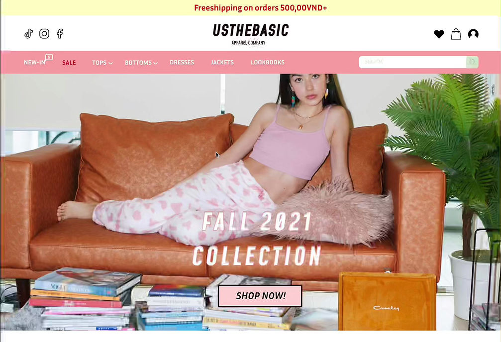
ORIGINAL WEBSITE
Usthebasic is a famous local brand in Vietnam, a country in Southeast Asia. The brand aims at providing basic yet high quality clothes and accessories for customers, with various collections released each season. Usthebasic website is similar to any other shopping online website, where the users can view the products, add them to cart, then check out for payment.


POSITIVE COMPONENTS
-
Smart strategic intent: displays the purpose of the website clearly to the audience with the information showing on the homepage.
-
Homepage: includes everything that the users might be interested in, from the menu bar with different categories on the top to different collections while scrolling down, from lookbooks to new arrivals and on-sale products.
-
-
Provides thorough information in an interactive way on each product in a specific category, from price to color to size chart to model's photos.
-
Product page: when the mouse enters any product, the product's photo will change constantly, providing detailed photos of the products in different views and colors to the customers.
-
Single-product page: provides special labels for products, such as “best sellers" which encourages the users to click on, and “sold out" to prevent them from clicking and find other products.
-
INFORMATION ARCHITECTURE

CARD SORT DATA
My card sorting exercise is to categorize the related key terms for Usthebasic, the website that I am redesigning. I made 11 cards for the 11 groups on the site, including groups related to the personal account and groups related to the products. The three test subjects I selected are all appropriate for Usthebasic's target audience; their ages range from 14 to 30, and their user status ranges from no experience to regular users. Rather than a specific user criteria, I can obtain more reliable data by selecting three test subjects with diverse demographics and psychographics. The key terms are sorted similarly, so I inquired as to why this is the case. Essentially, users simply place the term in the category that they typically see together on other websites, or they use their intuition and logic. The card sort exercise results in a similar sitemap that I intended, so I did not change anything and just simply based on it. I only add more navigation to make the site more interactive in some aspects.
USER PERSONA
Usthebasic is a women’s clothing brand, so its intended user also narrows down to women only. The brand also targets only women who live in Vietnam, both Vietnamese and foreigners, as it does not provide worldwide shipping. The style of Usthebasic is very colorful, youthful, and trendy, so the intended age range shrinks from teenager to young women, from around 14 to below 30 years old, especially Gen Z consumers. These audiences are also mostly prive-driven consumers, as the brand has constant discounts throughout the year, and its price is also relatively cheap in Vietnam. With its price range, the income level of the buyers does not limit to any social class as it is reasonable for people from lower to high class. However, the most common buyers' income may range from $2500 to $5000 a year, as each product costs around $8 to $25. The site is open for all types of users, from newbies to regular to professional users, as its design is typical and easy to use.

REDESIGN GOALS
I have fIVE main redesign goals for the website Usthebasic, including reorganizing & recreating visual appeal, constructing consistency, building appropriate sizing at each breakpoint, reducing steps to shop, and increasing interactive media with users.
For the reorganizing goals, I will be using the sitemap to classify the categories again, making sure that no products are overlapped and products are divided according to their characteristics. My next goal is to enhance the visual appeal of the design of the site, as it is plain and unappealing to the audience. To do this, I will redesign the logo, choose an aesthetic font and pick a lovely color scheme that matches the style of the brand. I will also keep a consistent layout for all pages by maintaining the menu bar and providing information for every product. Lastly, I will make the site more interactive by adding more animation when the user takes action toward the products such as hovering through a product or collection.
REDESIGN SCOPE

ATOMIC DESIGN
COLOR PALETTE

As most of the clothes from this brand are pastel colors, I also chose a color palette for the website. I picked pastel pink and green as my primary colors. On the color wheel, these two colors are opposite with each other, which creates a complementary color scheme, forming a vibrant scheme. For secondary colors, I chose darker green and pink compared to the primary ones for some of the texts and box, combined with some pastel yellow. For tertiary colors, I chose gray, black, dark green, and white, which are used for the texts, highlighting them on the pastel backgrounds.
TYPOGRAPHY

WIREFRAMING THE SOLUTION
HOME PAGE

CONTENT-HEAVY PAGE

HIGH-FIDELITY SCREENS + FLOW
TABLET: SEPARATE COMPONENTS
MOBILE: SEPARATE COMPONENTS
DESKTOP: SCREEN-BY-SCREEN

WHAT CHANGES
I have reorganized the categories by removing unnecessary groups of products and combining them, making it less complicated for users to search for products. Moreover, the redesigned website is much more visually appealing compared to the original one as it is more aesthetic in terms of how the chosen fonts and color scheme work well together. Other than the change of fonts and color scheme, I also added more illustrations/icons and resized them to enhance readability for the users. Next, I recreated the menu bar and kept it consistent throughout the homepage to the interior pages. However, there are still some margin errors as I did not use the wireframes as a base, which is a flaw in my attempt to keep consistency. For the interactive part, I added many interactions that help the buyer to buy the product more easily, such as the “Quick buy” interaction, which allows the customers to add the product to the cart directly without navigating to another page.

I mocked up the main screens for the website based on the sketches and the original website:
-
Home Page: general content that helps the users explore the products more easily such as new collections, best sellers, and on-sale products
-
Content-Heavy Page: shows a list of products based on the user's demand navigating from the Home Page
-
Single Product Page: displays specific information about the product that the user specifically interested in
-
Check-out Page: shows the shortened process that makes the payment more specific and faster
-
Collection Page: presents how the collections can be structured more clearer and more appealing to the users.

UI DESIGN
DESKTOP
TABLET
MOBILE


HEURISTIC EVALUATION

RESULTS & KEY TAKEAWAYS
This was my first UI project done in Figma, and there were significant improvements throughout the process of iterative design. I began the project with the desktop prototype, and this prototype has more flaws compared to the two later prototypes of mobile and tablet ones as I get more used to the tools and find shortcuts to develop the interactions for the site. For instance, it is evident that the high-fidelity screens of the desktop website consist of more screens and step-by-step interaction, whereas the tablet and mobile are built with much fewer screens as many interactions are composed into separate components and then added later. This also creates much smoother interactions, as the screen-by-screen interactions create various displaced and inconsistent components after each behavior that the users make. Some key takeaways from this project are:
-
Focus on both the interaction and the design: An e-commerce site needs to be not only pleasing to the eye but a stress-free shopping experience as well. Throughout the project, the redesigned version's aesthetic has improved a lot, but I think I focused too much on the visual appeal that I did not maximize the potential interaction of the website.
-
Every design components need to have a specific purpose: every added component into the prototype needs to have a clear function of telling the user what to do, not just for enhancing the visual appeal of the design.


